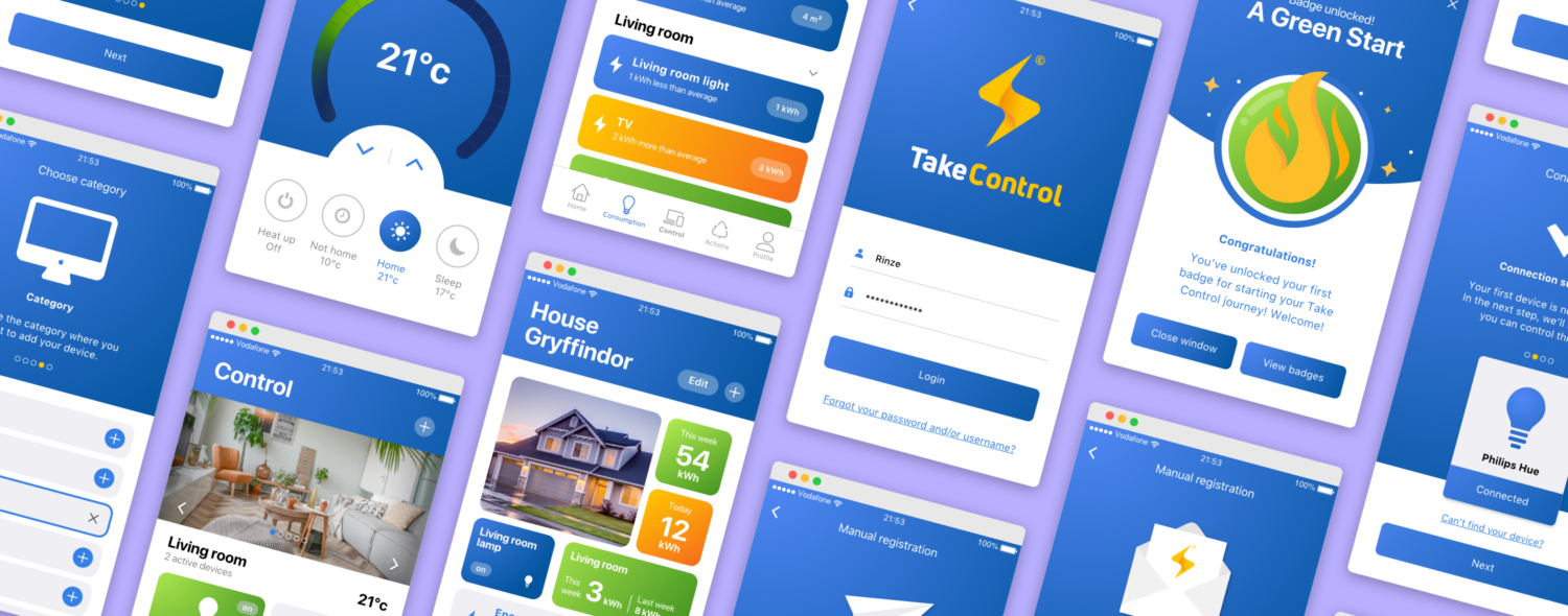

Energy Management Systems are on the rise. These systems allow their users to gain insight in their energy usage and take control over it. Some of these systems allow its users to automate their homes. For example, the users could automate their lights to turn on at a specific time (if this, then that).
However, the user experience of these relatively new products is still far from optimised. This leads to the fact that Energy Management Systems are currently only used by enthusiasts; users who are experienced with such systems and therefore are able to use advanced features more easily. These kinds of features aren’t accessible for the average person as they require more in-depth knowledge about technology. This prevents the majority of people from reducing their energy usage, which is a shame.
During this study, we focused on making Energy Management Systems more accessible for the early majority. Next to playing my part in the UX/UI research, design and testing processes, I also took care of the project management.
The project kicked off with a very broad briefing. In order to further clarify the goals and direction of the project, I organised a meeting with the parties involved: the research groups User-Centered Design and Communication & the Sustainable Society from the Hanze University of Applied Sciences and the EMS company Iungo. During this meeting it became clear that the interfaces of current Energy Management Systems on the market were far from user-friendly. This prevented the majority of people from saving energy through the use of Energy Management Systems. In agreement with the clients, we decided to focus on designing an accessible Energy Management System for the early majority and on how to stimulate user retention.
The new Energy Management System could target pretty much everyone who a) lives on their own, b) pays their own bills and c) who is fairly receptive to innovations. However, a target audience with these specs would be too abstract to target effectively. Therefore, we split this group into three more tangible segments: students living outside their parental home, starters on the housing market and seniors (65 years and older) who still live on their own. Making the user segments tangible like this, helped us empathise more effectively throughout the project.
After determining the project scope and defining the user segments, we were able to articulate the information we needed. I formulated the following research question:
How do you create a better user experience for Energy Management Systems and stimulate active use while focusing on multiple and different target groups?
We divided it into several sub-questions which we answered by studying relevant literature and talking to relevant people. These answers collectively provided the answer to the research question stated above.
The improved user experience can be achieved by adapting the design of the Energy Management System to the cognitive and physical functions of the targeted user groups. In addition, the user interface should be easy to use, comprehensible and look attractive. These factors, combined with the system offering comfort and security, could lead to an improved user experience. However, in order to save energy, the user should not only find the system pleasant to use, but also actively use it. According to our research, active use can be stimulated by applying gamification techniques and structurally providing the user with feedback.
We used the results from the exploration and research activities to set up design requirements for the final product. Based on these requirements, I organised a timed brainstorm session with the team. We tried to generate as many ideas per requirement as possible, while the timer prevented us from overthinking our first thoughts too much. This resulted in a room full of post-its and a wide variety of implementation options. After completing the brainstorm session, it was time to structure the output. We grouped corresponding ideas and defined clear categories (affinity mapping) for them. This gave us a concrete list of areas to focus on.
Next we prioritised the implementation options by using the MoSCoW method in order to determine which concepts we really wanted to develop and test. This overview allowed us to spend our time right.
After doing the brainstorm session and ordening the output, we decided to split the team into three duos. This allowed us to develop multiple prototypes simultaneously so we were able to test a larger amount of ideas from our list. Each duo focussed on a specific area of the application, so we were able to merge the prototypes later on. The duo I was a part of worked on the profile section and the devices section. We kicked off by sketching and discussing our ideas. Then we converted these sketches into an interactive, lo-fi prototype by using Sketch and InVision. The others duos did the same for different areas of the product, applying different retention techniques.
After developing the three lo-fi prototypes, we invited an expert on the field of user-centered design to test our prototypes. For this session, we created a number of tasks per prototype which the expert should try to accomplish. While he was executing the tasks, the expert provided us with some useful feedback. Based on these new insights, we made some adjustments to the prototypes before we started testing with the users.
After processing the feedback from the expert review, we tested the three lo-fi prototypes with the users. Our goal was to find out if the prototypes were accessible for the potential end-users of the product. Therefore, we tested both the usability and interaction design of the prototypes by using task scenarios. We observed how different types of users were interacting with the prototype while trying to accomplish the given task scenarios.
Eventually, we tested all three prototypes with all the different user-types we defined during the exploration process. Testing each prototype with multiple user groups lead to some interesting insights. An example: some layouts were experienced as overwhelming, while some buttons were too small and therefore too hard to notice.
Next to the usability testing, we also interviewed the users. The goal of our clients was to gather information about how different types of users were responding to different types of retention techniques in an Energy Management System. Therefore, we included multiple interview questions on how the users experienced the applied retention techniques. (The results can not be shared due to non-disclosure agreements.)
We testen the prototypes with the three defined user-types from the exploration phase. Testing each prototype with every user-type lead to some interesting insights. For example, the tests showed that some users were confused about the layout or design of some buttons and could either not find them or could after receiving more directions. We were happy with the results, since these were all issues that a lo-fi prototype was made to solve. The lo-fi design enabled us to iterate quickly, before adding the visual design layer.
“ The students experimented a lot; because of their work, we now better understand how we can make these types of systems more accessible for the average person. ”
After receiving the user feedback, we processed it and merged the three lo-fi prototypes into one. This was our blueprint for the hi-fi design which was designed in Sketch. We went for a clean and user-friendly look and feel.
After the visual design was finished, we turned it into an interactive prototype by using Framer.
During this project I learned a lot about the value of good user onboarding. We’ve challenged ourselves to make technical features accessible for casual users. We really tried to build on what was familiar for the users; what patterns they were already using. Also, we focused on raising the user’s confidence on mastering the system. For example, after guiding the users to add their first device, we’ve let them play with the on/off switch to show them they succeeded in adding a device. Knowing the roadblocks for your potential users to adopt your system and implementing the right onboarding techniques to overcome these is extremely important for your engagement rates.
Testing the lo-fi prototypes with the seniors user-type was a real eye-opener for me. We saw them struggling with text-size, contrast and deciding which elements were clickable. We really experienced the need for extended usability. For example: by taking in account the accessibility guidelines for older users. When designing for seniors, this should absolutely be one of your top priorities.
The biggest challenge of this project was to find the right balance between quality and quantity. Ideally, we wanted to design literally every part of the product, but we also wanted to implement retention and usability techniques with care. We tried to find a balance between both by taking a closer look at our project goals. We decided to focus on designing only the essential parts of the app so we were able to maintain a high quality standard. This way testing results would not be affected by poor design execution. Based on our project goals, we were able to set our priorities straight and pick the right quality/quantity balance doing so.
While the whole project was an interesting journey, I especially liked researching and applying gamification techniques. By implementing these techniques right, they can really help to motivate your users to stick to your product. For example: badges are a fun way to tell your users they are doing something right. This enables you to build a pleasant relationship with your product’s audience. However, excessive use can have a counterproductive effect. Therefore, you need a proper strategy.